Make a hard product feel effortless.
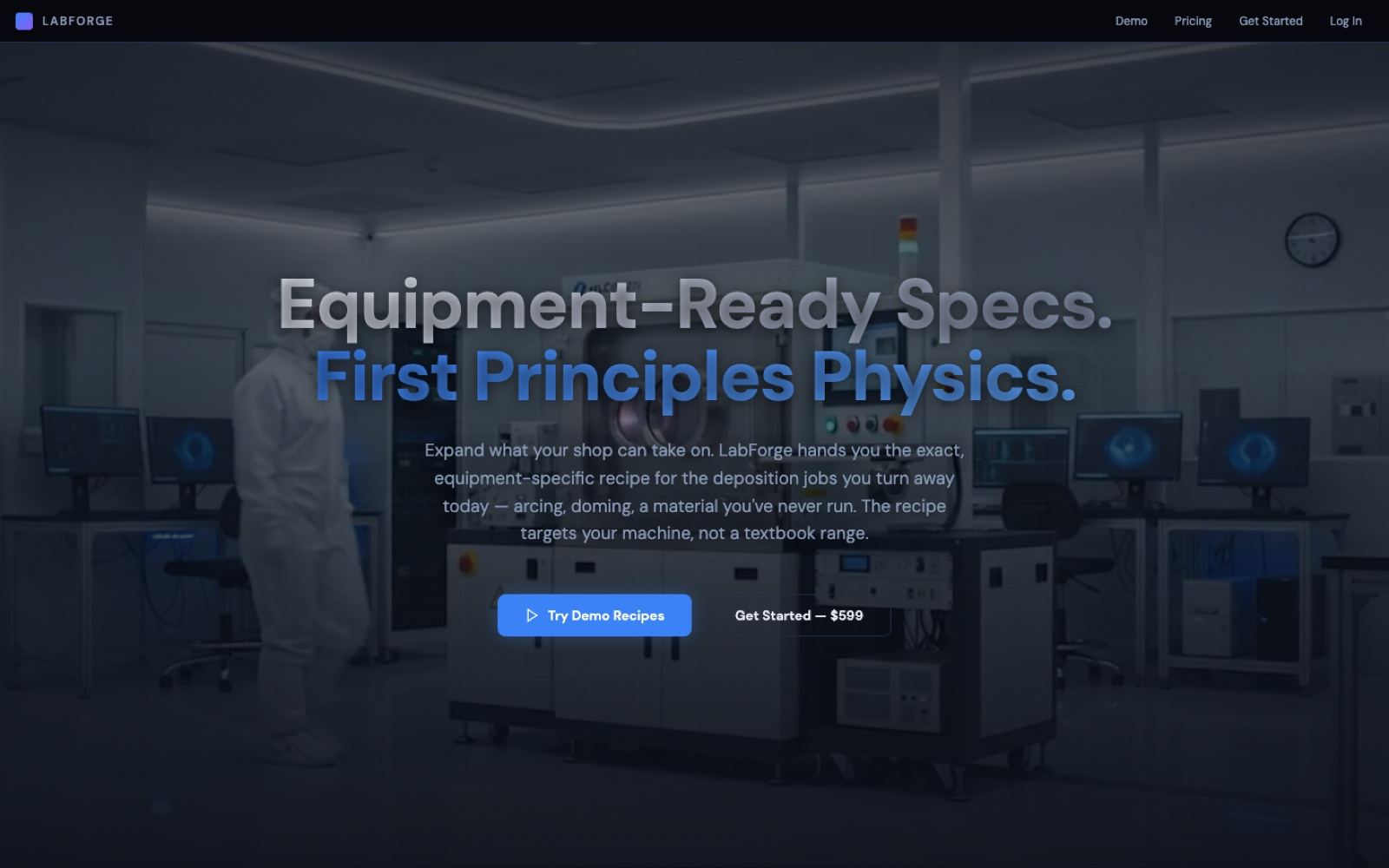
The product is technical and the buyer is skeptical — fabrication shops don't hand money to a website that looks unsure of itself. So the job was to build a face that reads as confident, precise, and premium the moment it loads. One clean sans logo, a dark cleanroom aesthetic, a single blue accent, and a headline that states the promise without hedging: "Equipment-Ready Specs. First Principles Physics." The site is the product's marketing in its own words — my work is the surface it says them on.
The whole surface.
A clean sans wordmark and a restrained system — dark base, a single blue accent, generous space — that reads as a serious instrument, not a toy. Built to hold up on a landing hero and inside a dense product screen alike.
A short cleanroom-inflected loop that plays silently behind the hero — motion that sets the tone before a single word is read, then hands off to the copy.
A premium dark page over a cleanroom / lab photograph — hero headline, the pitch, and a clear path to action. Every section earns its scroll; nothing is decoration for its own sake.
The interface a shop actually works in — laid out so a dense, technical output reads cleanly and the next step is always obvious. The same restraint as the brand, carried into the app.
A Try Demo Recipes path lets a shop feel the product before paying, and a dedicated pricing page states the offer plainly — no dark patterns, no maze.
One primary call to action — Get Started — $599 — carried consistently from hero to footer, so the buyer never has to hunt for the way in.
Dark, premium, sure of itself.
The whole identity sits on a dark cleanroom photograph with a single blue accent doing the pointing. It's the visual equivalent of a steady voice — no gradients shouting for attention, no stock-illustration filler. The screen below is the live landing state: headline, promise, and the paths into the demo, pricing, and sign-up.
A live product, shipped.
| Product | LabForge — a live SaaS at labforge.us |
| What it sells | Equipment-specific process recipes for fabrication shops |
| Site headline | "Equipment-Ready Specs. First Principles Physics." (the product's own tagline) |
| Design | Dark, premium, over a cleanroom photograph · single blue accent · clean sans logo |
| Hero | A looping brand film — labforge-loop.mp4, silent, autoplay |
| Try before buy | Try Demo Recipes — a hands-on demo path |
| Pricing | Dedicated pricing page · Get Started — $599 primary CTA |
| My role | Brand identity, dark landing site, and product UI — end to end |
Brand and product, one hand.
The logo, the film, the dark landing page, and the interface a shop works in all came from the same place — so the promise the marketing makes and the experience the product delivers feel like one thing. That's the point of the case: I set the tone and build the surface that keeps it, from first impression to sign-up.